How to turn Firefox into a usable web browser
This article is outdated! Firefox now ships a sidebar natively, and honestly, that alone is probably good enough for 99% of use cases.
Mozilla says that Firefox will be shipping better profile management and vertical tabs sometime soon. Until then, this blog post serves as a writeup about how I customised my Firefox experience to work the way I want it to.
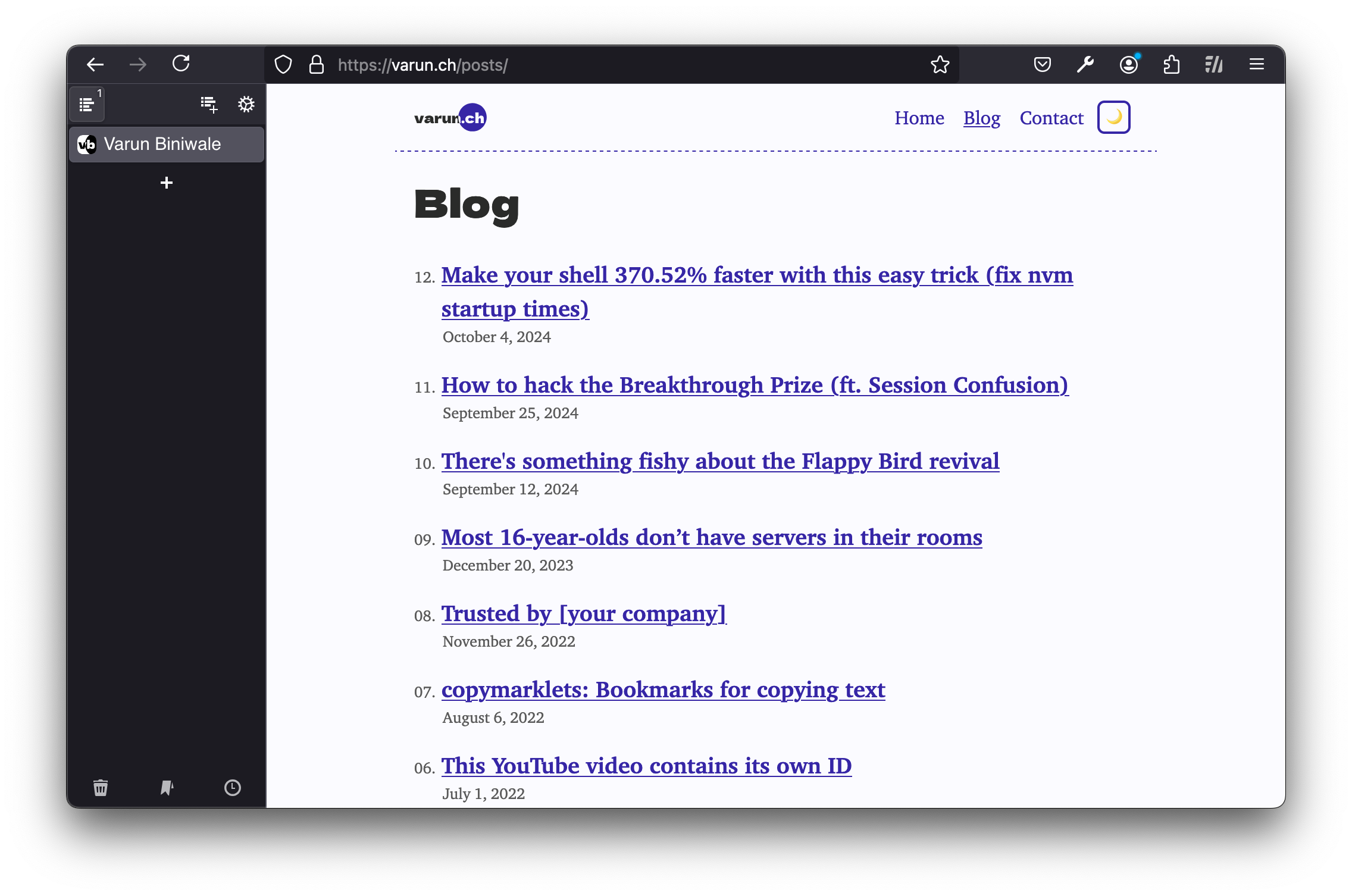
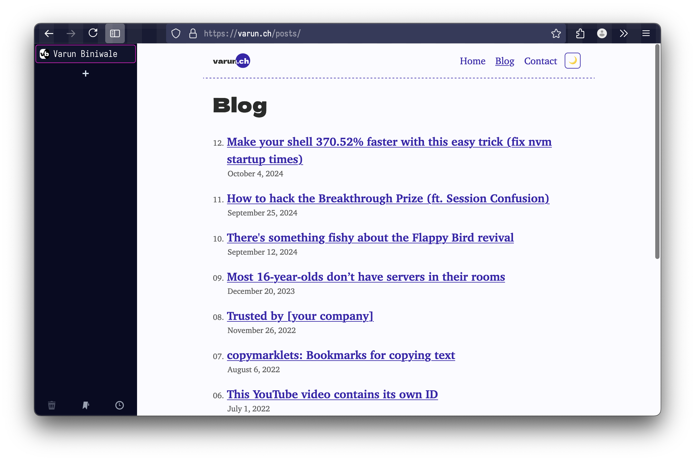
By the end of this article, you will learn how I turned Firefox into a minimal, keyboard-driven and productive browser that looks like this:
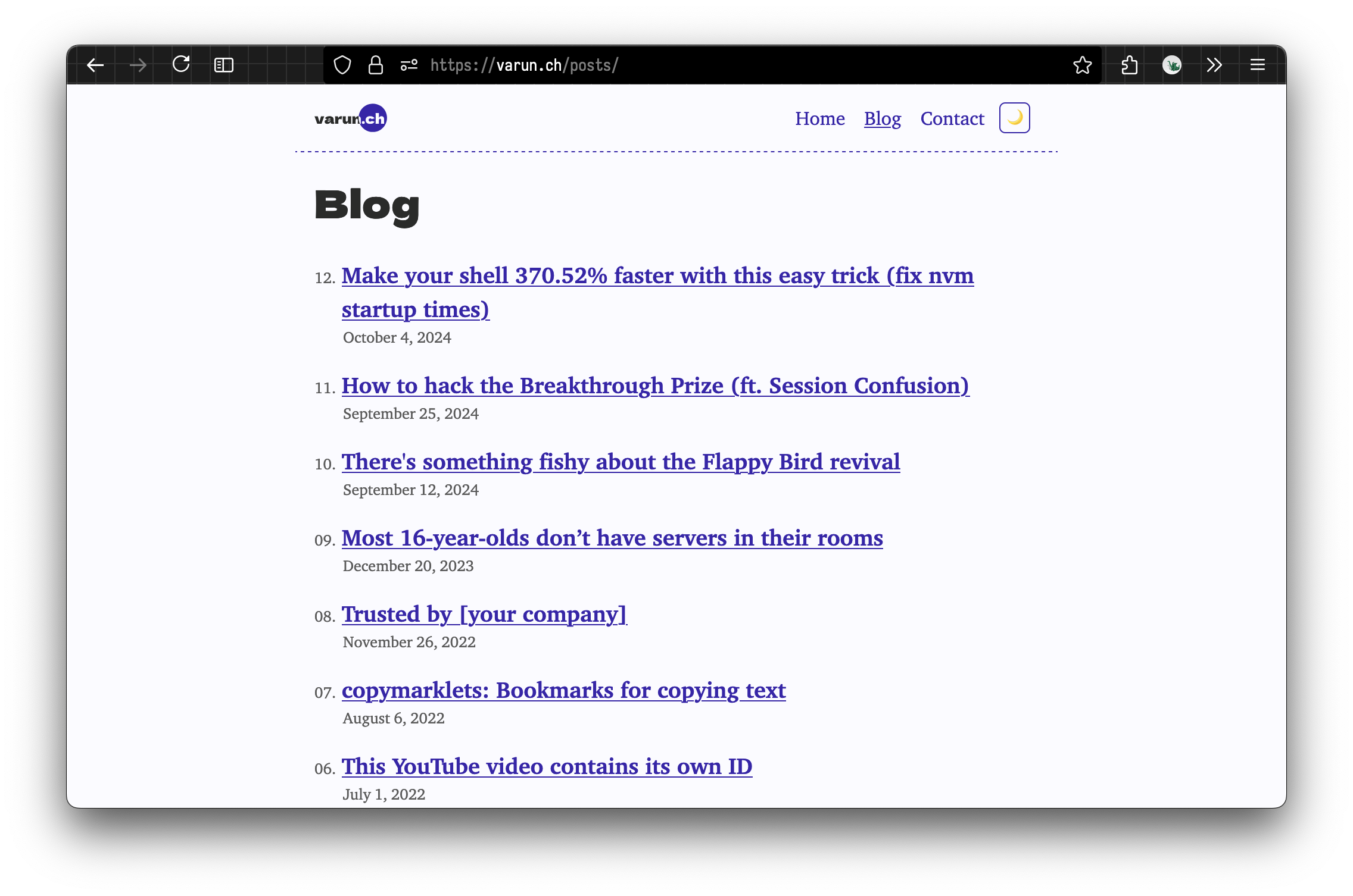
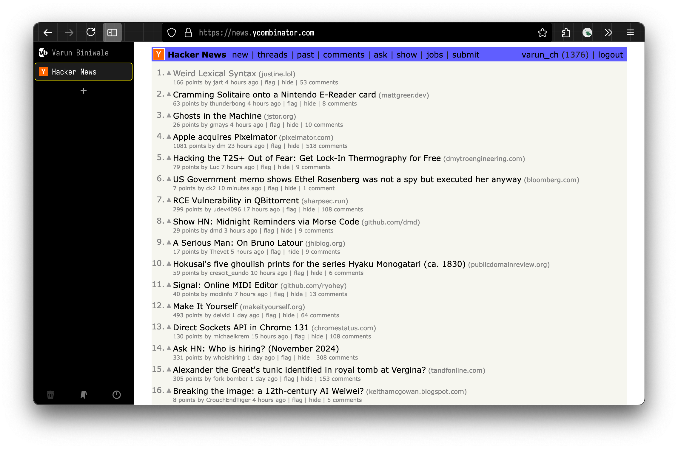
Background #
I hate Google Chrome. As in, I’ve been using Google Chrome since my birth, and I hate it. My first ever experiences on the web were on Google Chrome, the first laptops I used were Chromebooks at school, and when I finally got my own laptop, the first thing I installed was Google Chrome.
Google Chrome is a good web browser. It’s fast, efficient and most importantly, the web is built for Google Chrome. You will never find a website that doesn’t work on Chrome. Ultimately a web browser is a tool, so I will use the one that works the best.[1].
Unfortunately, Google’s business model results in Chrome being used as a tool for Google to track you. I am uncomfortable with this. This year, I have been trying to reduce my dependence on Google products.[2]
Last year, I switched from Chrome to Arc Browser, for two main reasons. Firstly, to try something new, and secondly, because I believed it was more privacy respecting than Google Chrome.
Arc is a browser based on Chromium - while some may object to this, I see this as an advantage. Any webpage designed for Chrome (which is unfortunately all of them) will work perfectly fine in Arc. Again, a web browser is a tool, so I will use the best one that exists.
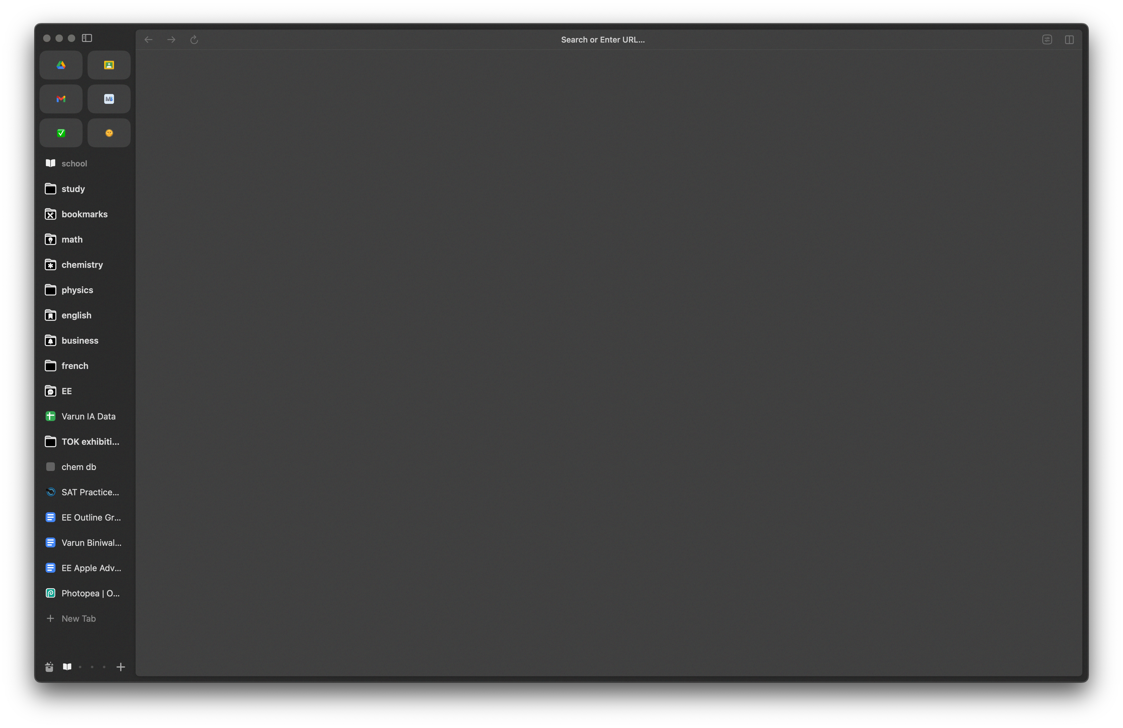
Arc sells itself to people who want to organize their tabs. I certainly use a lot of browser tabs, but it’s never been a huge problem for me. Regardless, Arc’s solution to this works really well. Arc merges the idea of bookmarks and tabs into one sidebar, and this clicked for me. Essentially, you can use your bookmarks (“pinned tabs”) as if they were normal browser tabs, and they revert back to their pinned location when you close the page.
Trouble in Paradise #
I like to hack things. I was curious about the kind of technology Arc uses under the hood, so I started to reverse engineer the app’s network traffic on my Mac.
It would phone home constantly, which I was a little shocked by, and uncomfortable with. I also was not a huge fan of Arc’s dependence on Firebase, which is a Google product (more tracking!) and notoriously hard to secure [3] I also thought about how while I understood Google’s business model (more user data = more targeted ads = more revenue), I had no idea how The Browser Company makes (or intends to make) money, as a VC-funded startup. As a result, I was worried that Arc would either integrate features I don’t want, implement some kind of subscription service, or shut down entirely. None of these seemed like ideal scenarios.
My suspicions came true twice recently. Once was when xyzeva disclosed an incredible security issue in Arc and demonstrated more of the browser’s phone-home behaviour, and secondly, when The Browser Company announced that they were putting Arc aside to make a new browser aimed at the general population because “Arc would never reached one billion users”.
That Other Browser #
In search for a better browser, I found myself on Firefox. Apart from Chrome and Safari, it’s the only independent browser that people actually use, so many (but not all!) websites actually work in Firefox. uBlock Origin also works best on Firefox.
Firefox is basically subsidised by Google, but as long as I can disable any tracking, I don’t see this as a major dealbreaker. I don’t think Firefox tracks data for Google anyway.
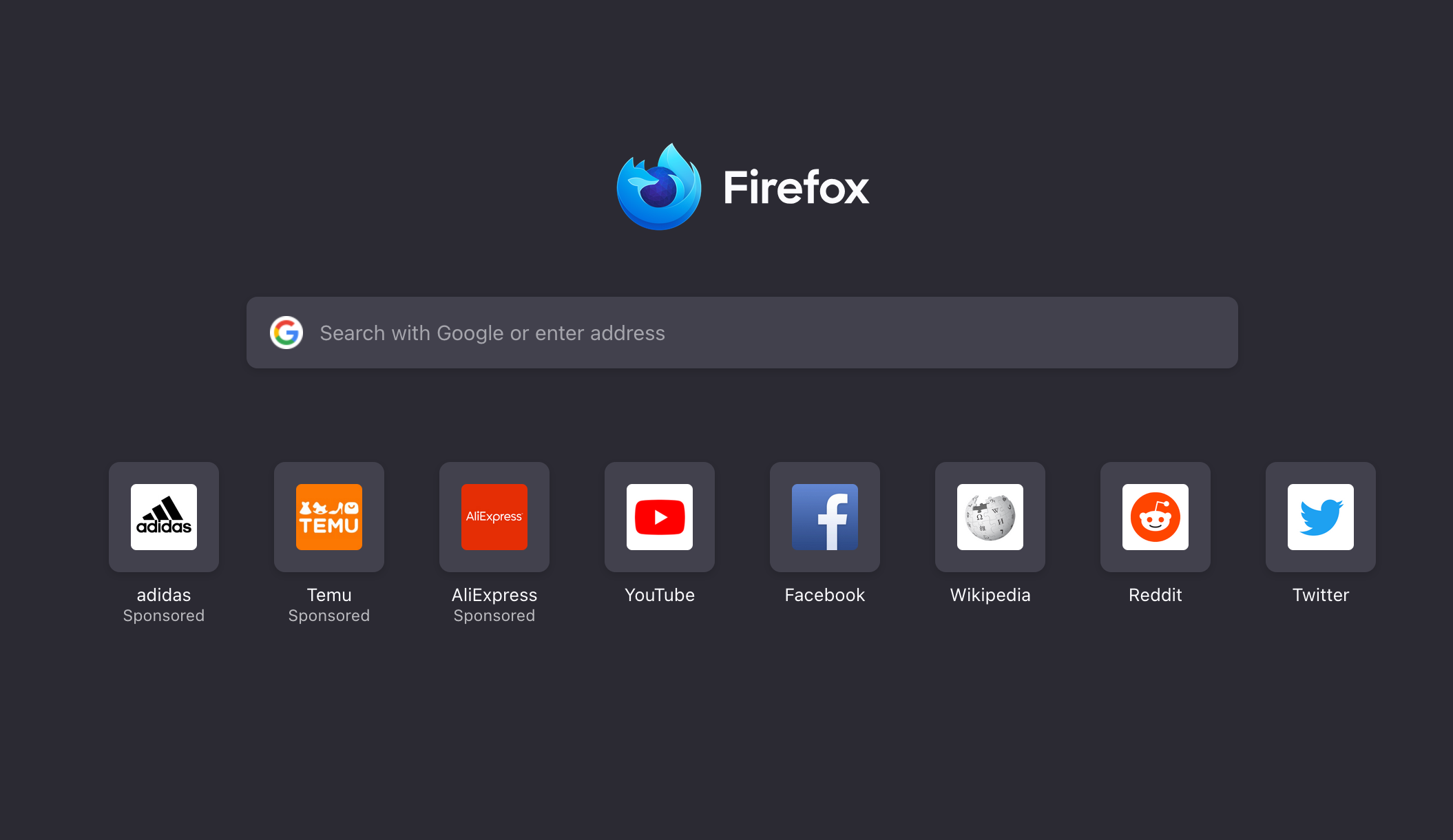
It also comes with ads baked in.
Firefox works fine. It’s a little slow to startup on my M2 MacBook Air, but once it’s running, it works fine. There are some small annoyances (I wish I could thisisunsafe my way out of HSTS errors, and installing homemade extensions is difficult for no good reason), but none of them come close to the big dealbreaker with Firefox.
Firefox doesn’t really support browser profiles.
Browser Profiles #
I don’t understand how people can use the web without browser profiles. Chrome’s support for separate profiles is great. Arc’s support is amazing. Firefox’s is not.
In this world, there are at least three Varun Biniwales. One is a high-school student at a school in Zurich, another is a 17-year-old developer who has a personal blog, and is applying to university and the other one last worked at the Scratch Foundation. Separation between my school, personal and work profiles is an absolute must have.
On Chrome, each profile acts as a separate installation (with separate cookies, bookmarks, extensions and settings), but there are some niceties like an easy profile switcher and the separate profile windows count as one application on macOS (so you can just ⌘ + ` through them like normal windows)
Arc makes this a little better, with spaces and profiles. The sidebar lets you select a ‘Space’, which can be assigned to a browser profile. This solves the issue of having a billion browser windows open, because there’s only ever one Arc window open, and it displays only the profile you want. This comes down to individual taste, but I found it the best to focus in, as once I closed the sidebar, I would be fullscreen in a webpage with no easy way to switch to another window to procrastinate. Arc also shares some essential settings, but again, leaves cookies, bookmarks and extensions separate across profiles.
Firefox does not have profiles. Firefox has “containers,” which are simply not the same thing. Containers isolate cookies, and only cookies, which solves tracking and convenience issues, but they do not isolate bookmarks, extensions, and settings, which to me are must-haves. I use separate browser extensions (e.g., certain dev tools) in my personal account, which I would not want to risk sharing with my work or school accounts. Similarly, I never want any work- or school-related materials to leak into my personal life. Browser profiles help me focus, and so they’re a necessity. [4]
I lied. Firefox does have profiles. But you could be forgiven if you didn’t know that visiting “about:profiles” in a new tab and using an interface that looks like this was the way to manage them:
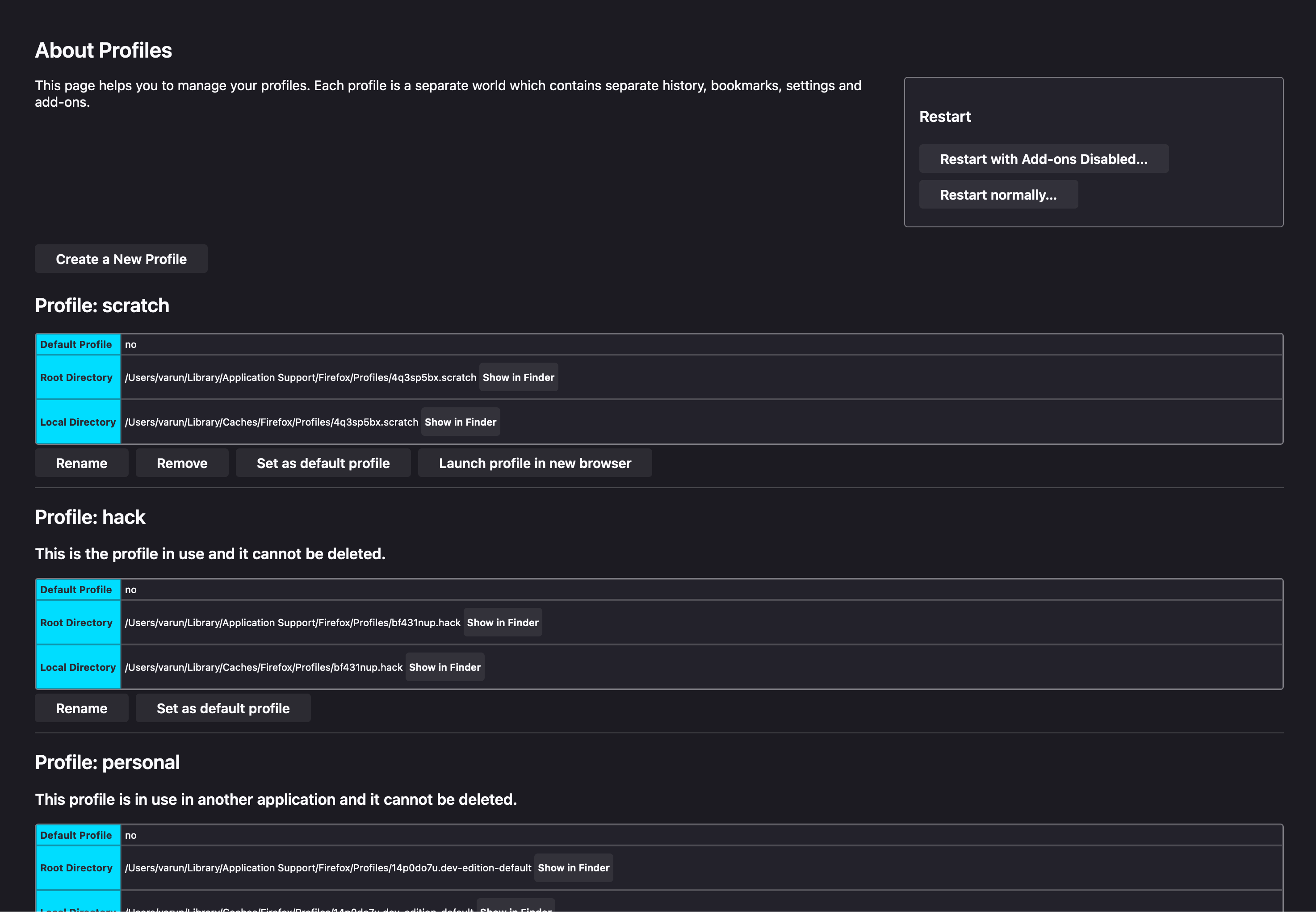
Once you have your profiles set up, you’ll find that they are even more isolated than Chrome. But there is zero integration between profiles (eg. the ability to send a tab to another profile), and they even show up as separate entries in the macOS dock and switcher. Unfortunately, there’s also no way to differentiate between profiles as they all have the same icon, and there’s no profile switcher in the interface. Until Mozilla makes profiles usable, simply install this unmaintained browser extension, and the associated connector, which prompts you for your password whenever you restart your computer (no idea why). But once it’s all done, you’ll have a decent menu to control your profiles, just like in Chrome.

(note that Firefox is supposedly shipping a native tab sidebar soon, but as of writing, even with the flag enabled, there is no keyboard shortcut to open and close it, so it’s useless for me right now)
Sidebery #
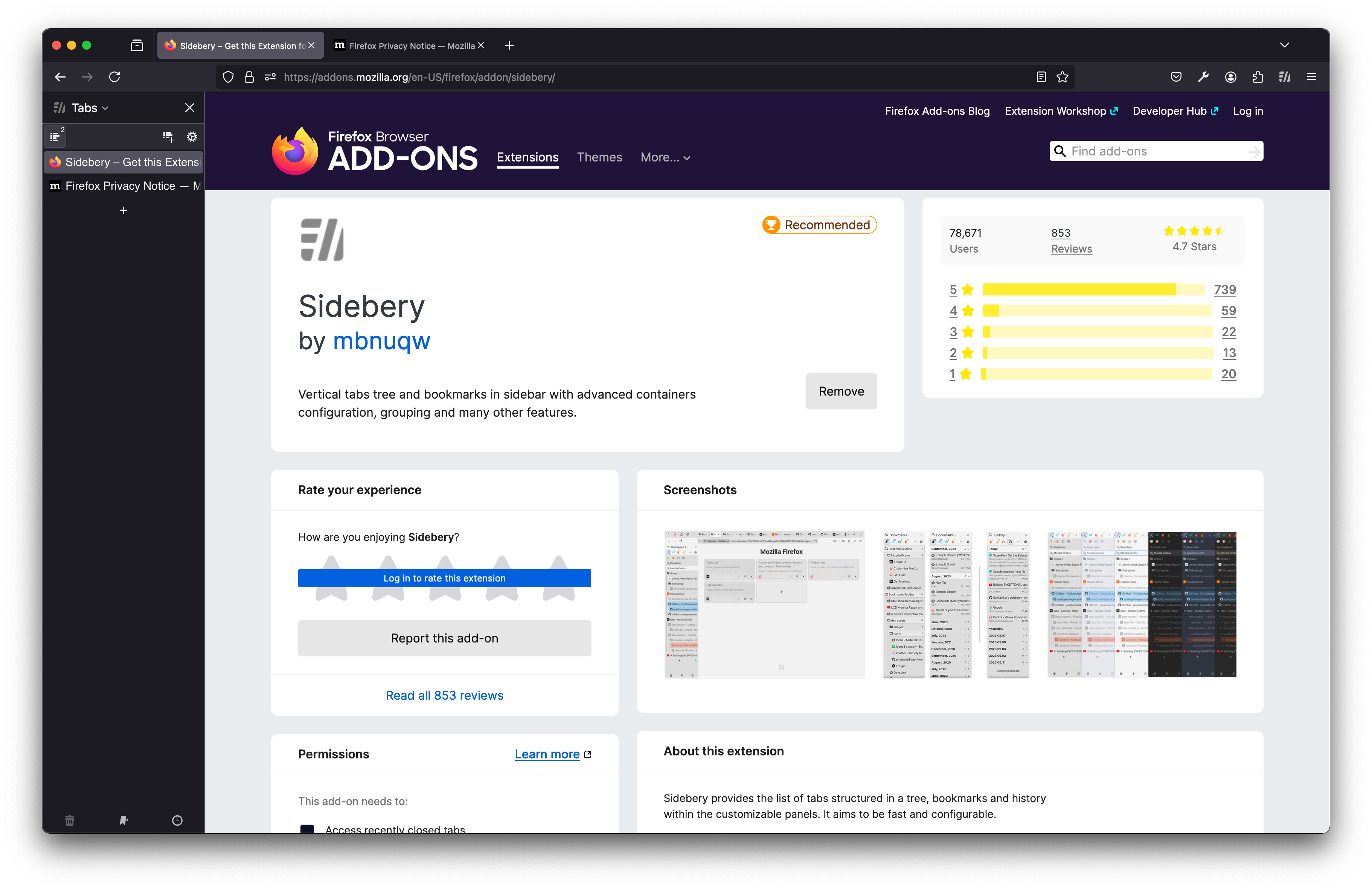
Sidebery is an amazing browser extension for Firefox. It acts as a new type of sidebar (Firefox has native sidebars for eg. bookmarks), and manages tabs in a way that almost feels native. By default, it can be opened and closed with Ctrl+E
Of course, this is silly unless you can hide the default tab bar.
userChrome.css #
Go to about:config, and enable toolkit.legacyUserProfileCustomizations.stylesheets. Then go to about:support and open the profile’s folder. Add a folder called chrome and create a file named userChrome.css. You are now free to literally style the browser’s interface to your hearts content. If you’re anything like me, this will blow your mind, because there’s now basically no limits on how your browser looks, and to some extent, how it functions. Firefox also has a “Browser Toolbox” that lets you use the Inspector on the actual browser chrome.
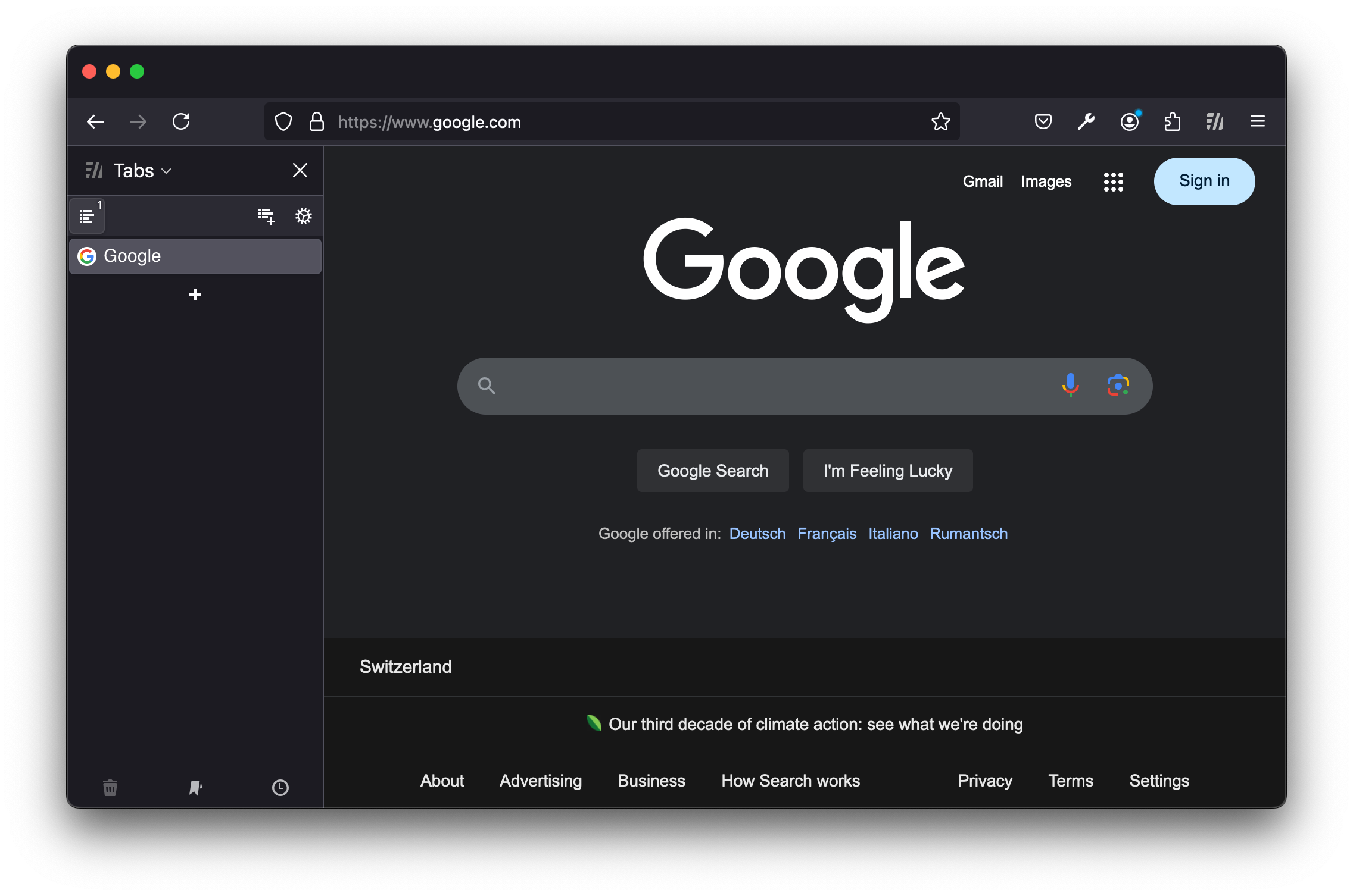
I use the following CSS to hide the tab bar.
#main-window[tabsintitlebar="true"]:not([extradragspace="true"])
	#TabsToolbar
	> .toolbar-items {
	opacity: 0;
	pointer-events: none;
}

#main-window:not([tabsintitlebar="true"]) #TabsToolbar {
	visibility: collapse !important;
}
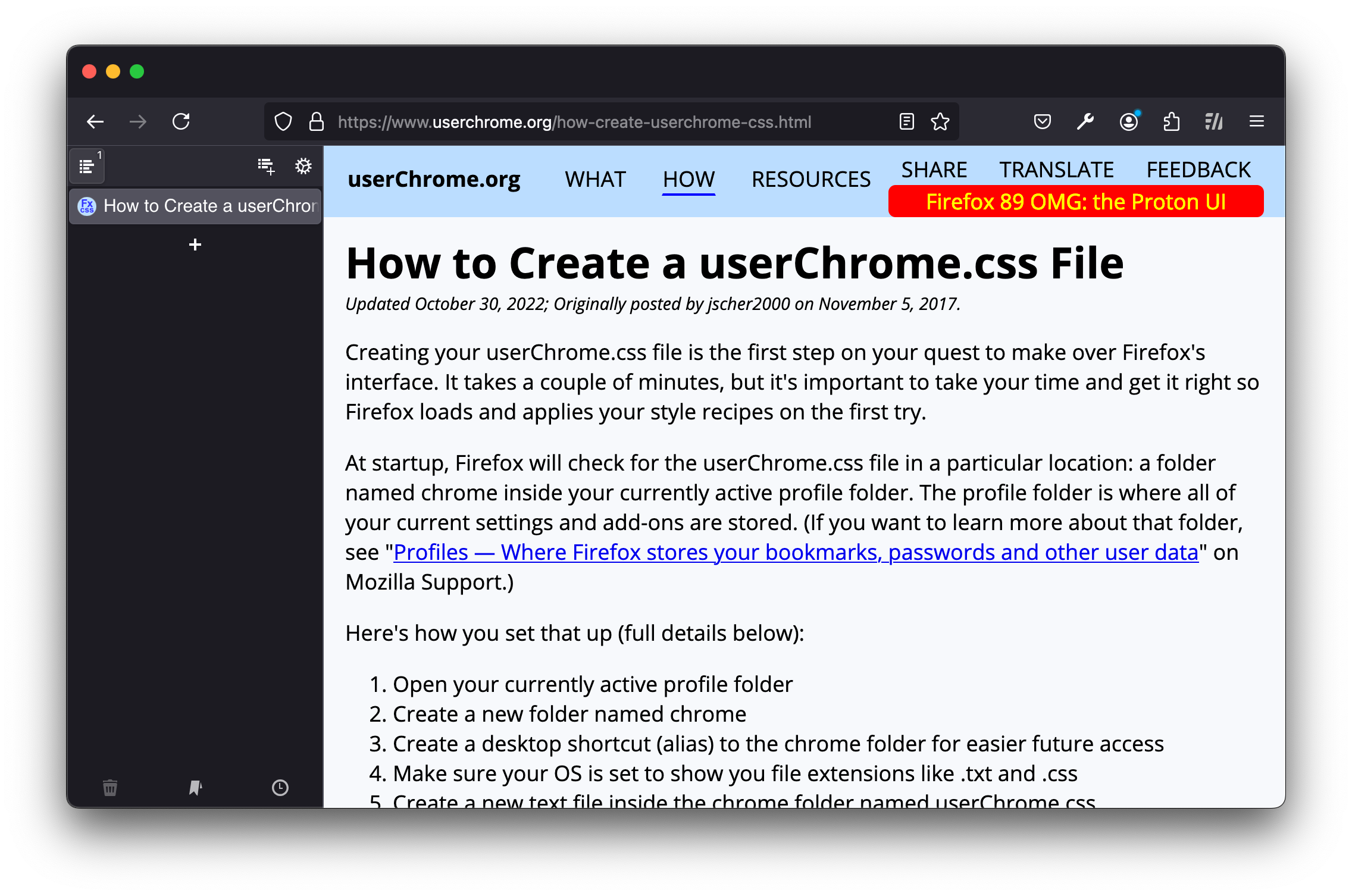
#sidebar-box #sidebar-header {
	display: none !important;
}
:root {
	/* Tabbar: reduce tab margin */
	--tab-block-margin: 4px 3px !important;
}

/* Tab: Reduce height */
.tabbrowser-tab {
	min-height: 24px !important;
}

/* Tab: Ensure tab height doesn't augment when arrowscrollbox is visible  */
#tabbrowser-arrowscrollbox {
	--tab-min-height: 31px !important;
	max-height: var(--tab-min-height);
}

/* Tab: Attention icon */
.tabbrowser-tab:is([image], [pinned])
	> .tab-stack
	> .tab-content[attention]:not([selected="true"]),
.tabbrowser-tab
	> .tab-stack
	> .tab-content[pinned][titlechanged]:not([selected="true"]) {
	background-position-x: left 2px !important;
	background-position-y: bottom 12.5px !important;
}

/* URLBar: Fix vertical alignment */
#urlbar[breakout="true"]:not([open="true"]) {
	--urlbar-height: 20px !important;
	--urlbar-toolbar-height: 24px !important;
}

/* URLBar: Fix URL address vertical aligment when megabar is open */
#urlbar[breakout="true"][open="true"] {
	--urlbar-toolbar-height: 30px !important;
}

/* URLBar: Reduce row items padding */
.urlbarView-row-inner {
	padding-inline: var(--urlbarView-item-inline-padding);
	padding-block: 2px !important;
}

/* URLBar: Reduce and realign row bookmark icons */
.urlbarView-type-icon {
	width: 10px !important;
	height: 10px !important;
	margin-bottom: 0 !important;
	margin-inline-start: 10px !important;
}

/* URLBar: Reduce "This time, serach with" padding */
#urlbar .search-one-offs:not([hidden]) {
	padding-block: 4px !important;
}

/* Searchbar: Ensure toolbar height doesn't augment when searchbar is visible */
#urlbar-container,
#search-container {
	padding-block: 0 !important;
}

/* Searchbar: Make sure the min-height of the input is the same as the popup */
#search-container {
	min-width: 192px !important;
}

/* Toolbar: Reduce spacing */
#urlbar-container {
	--urlbar-container-height: 30px !important;
	margin-top: 0 !important;
}

/* Reload Button: Fix vertical alignment */
#reload-button {
	margin-block-start: -2px !important;
}

/* AppMenu: Header */
.panel-header {
	padding: 4px 0 0 4px !important;
}

/* AppMenu: Header button */
.panel-header > .subviewbutton-back {
	padding: 4px !important;
}

/* Windows 10 context menu */
@media (-moz-os-version: windows-win10) {
	/* Context Menu: Reduce vertical space */
	menupopup > menuitem,
	menupopup > menu {
		padding-block: 2px !important;
	}
}
And also, since I never actually ever click them, why not get rid of the traffic light icons on the app in macOS altogether!
/* remove the 'native' titlebar (traffic light buttons and all) */

#TabsToolbar {
	display: none;
}

/* but it should be visible non main browsers */

#main-window[privatebrowsingmode="temporary"] #TabsToolbar {
	display: flex !important;
}
* {
	font-family: Iosevka, Monaco, "Courier New", monospace !important;
}
Synchronising your userChrome across profiles #
All of this is wonderful, but you’ll have to duplicate all your work to style each browser and keep those in sync. Fortunately, Firefox supports CSS @import, so you can just write one main stylesheet, and import it for each of your browser profiles.
@import url(file:///Users/varun/Documents/code/firefox/base.css);Finally, I customise each profile’s theme with Firefox Color, and I keep tiny colour tweaks per profile, like this
:root {
	--focus-outline-color: #cd23b9 !important;
	--in-content-primary-button-background: #cd23b9 !important;
	--in-content-primary-button-background-hover: #cd23b993 !important;
	--in-content-primary-button-background-active: #cd23b95c !important;
	--in-content-page-background: black !important;
}

.urlbarView-row[selected] {
	background-color: #cd23b9 !important;
	color: black !important;
}
Other tweaks #
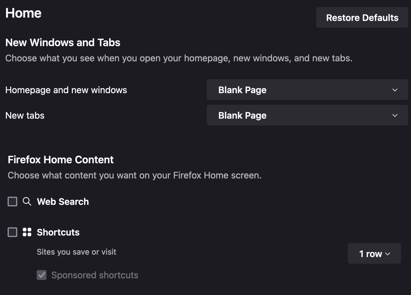
I also fiddle with various Firefox settings to make the browser more usable. I don’t use a browser homepage, so I disable that other “Home” in about:preferences
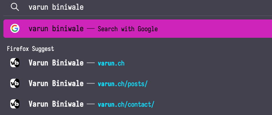
The unlabelled checkbox next to “Search Shortcuts” allows you to remove options from the the “This time search with:” bar. If you disable all of them, it removes the bar altogether, which makes it actually possible to tab through search suggestions with your arrow keys.
Before:

After:
You can also play with Sidebery’s settings, I like to set the ‘Navigation bar’ layout to ‘hidden’. It also recommends setting svg.context-properties.content.enabled in about:config to true, which allows Sidebery to pick up on your Firefox theme. Combine this with a font defined in Sidebery’s configuration to make it feel native.
Finally, in about:config, I set browser.tabs.closeWindowWithLastTab to false (to match Arc).
Bonus #
Was this worth it? #
Sure, I had fun. And now my web browser works the way I want it to. This is not for everyone.
The user experience on Firefox is still kilometres behind Arc until they can add vertical tabs and better profile management natively (and some of Arc’s niceties like ‘Little Arc’). Even still, I would sorely miss being able to switch “Spaces” with the swipe of the sidebar, something which Firefox seems architecturally incompatible with. Putting all my Firefox profiles on separate macOS desktops gets close, but it’s just not the same.
Despite all that, I still had a lot of fun customising my Firefox setup, and it’s been my daily driver for a couple months now. Ultra-custom Firefox is like the desktop Linux of web browsers.
Aside: Zen Browser #
Zen Browser is an open source fork of Firefox that aims to replicate something like the Arc user experience. It still falls short in a few ways, and I’m generally more comfortable using a reputable browser like Firefox, rather than putting the most critical software on my computer (after the OS) in the hands of someone new like I did with Arc again.
Web browsers also have massive vulnerabilities all the time, and of course, it would take time for forks to catch up. I can’t trust that Zen Browser is getting these patches quickly.
The ideal browser #
My ideal browser would be Chromium minus the tracking, and with a far more minimal keyboard-driven interface (ideally with vertical tabs). If it could have something like userChrome.css, that would be huge.